
Our world seems to be bursting at the seams with information. There is too much to take in at once. And even when we do bite off a chunk of information that we think we can handle, the information is often too complicated or convoluted to be digested, let alone masticated in the first place. A well-organized and visually-appealing graphic which presents the pertinent information can make an attractive gourmet meal out of a jumble of ingredients.
Presenting real information and even fictional stories has become increasingly visual. While the comic book market is decreasing (at least in the U.S.) the graphic novel market is exploding. At the same time, consumers of information want to see the data presented in a visually-compelling way.
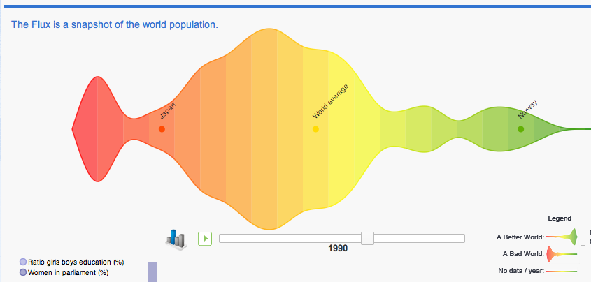
In Richard Byrne’s blog, “Free Technology for Teachers,†seven tools for constructing data visualizations are detailed. The first tool, Better WorldFlux, with its pre-entered data is an amazing example of how visually-intelligent graphics can quickly elucidate complex sets of data. I went to their site and experimented with the graphics by choosing just a few countries and data parameters. I could immediately see how Japan lagged behind most civilized countries in its inclusion of women in the legislative process and government, and how far ahead Norway was in comparison at the data starting point of 1987. Then, by scrubbing through the years to the most recent data set, I could see how far Japan had caught up in this area, so that it is almost in the average range now, and how Norway has remained in the lead among world countries in this aspect. Here is a snapshot of the percentage of women in parliament with data included showing ratio of girls’ to boys’ education in 1990:

One can see at a glance how far Japan lags behind the world average in this aspect and how progressive Norway is. If we scrub ahead using the year-indicator bar to 2010, we see that Japan has made considerable progress and is approaching the world average, while Norway still has a large proportion of women serving in the government.

For my own purposes, I use Google Web Analytics to keep track of trends in web traffic flowing to my website of free children’s sermon resources at www.kidsermons.com. I can compare the amount of web traffic for the current week with the traffic from two years ago, for example. I can see when the peak access times occur, and this can inform me as to when I should be posting the new children’s sermon for the following week.
The challenge for me is to find the correct tool and type of display for the information that one wants to clearly communicate. One of the best examples of visually displayed information that I have seen is the progression of economic and physical health of world countries over the years. While I have only begun to learn to use this tool, some are already masters of visual display. In one of the best demonstrations that I have seen, Hans Rosling shows how the general trend is toward richer and healthier countries worldwide. This is the type of visual information that can transform the world: